TEA BY G | PACKAGING & SELF-PROMOTIONAL PROJECT


PROJECT SUMMARY
This is a self-promotional project designed to show my unique selling point (USP) as a caring individual and highlight the benefits this could bring to a design team.
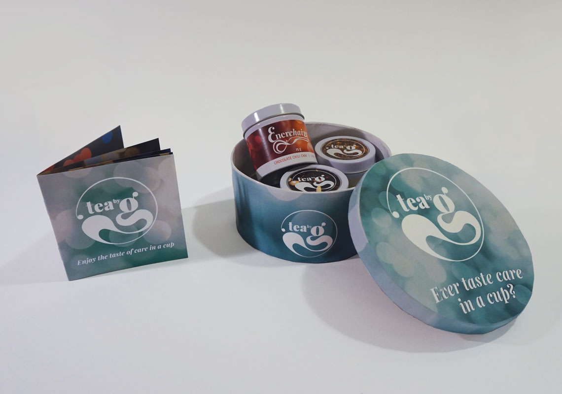
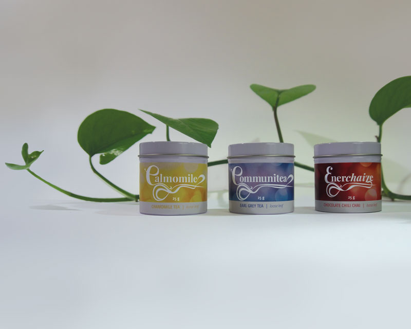
DESIGN PROBLEM AND OBJECTIVES
The Vancouver market for graphic designers is very competitive and this project will help set me apart beyond my design skills. It communicates my USP through the benefits of being a good listener, being a considerate and re-energizing presence, and acting as a calming diffuser.

DESIGN CONCEPT
The concept is to present my USP through the metaphor of a tea brand. I am like a caring cup of tea that can provide many benefits. There are three types of tea included, each one highlighting a benefit. Calmomile describes my tension diffusing presence, Enerchaize shows my consideration by providing a boost in energy and other benefits to a team, and Communitea reflects my skills as a good listener. The flavours match the benefits with Chamomile as an herbal tea to keep tensions low, chocolate chili chai providing energy and a sweet treat, and earl grey as a classic tea to have with a conversation.
The visual components are soft, round and convey a feeling of calm approachability. The logo and stylized typography feature a curvy trail of steam. Each tea has a unique colour to match its nature – an energizing red for Enerchaize, a calming and joyful yellow for Calmomile, and a trustworthy blue for Communitea. Throughout the brand, a bokeh motif adds a feeling of soft warmth and light. The package components are round to provide a friendliness, a convenient size, and to catch the attention of the audience. The tea tins have magnetic bottoms and could be placed on a fridge in a design office, to keep my design top of mind.